PEOSC Website

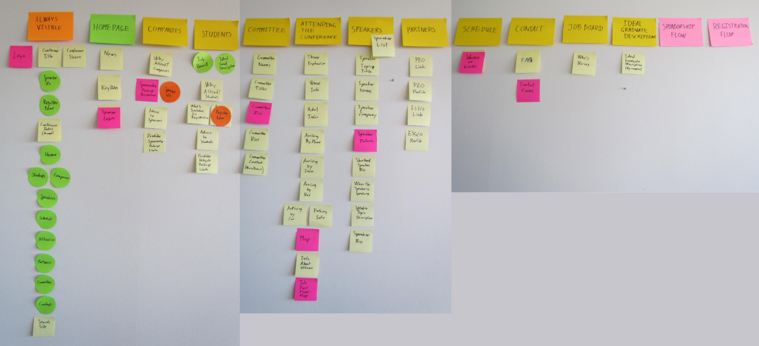
My first step was to make a list of all information items that would need to be communicated through the website. The goal of this was both to organize the site under realistic headings and to create a visual hierachy within each page. Text items were placed on yellow post-its while images and links were placed on pink and green post-its respectively.
These items were then grouped into categories, which would later become the pages of the website.
Finally, the items were organized within their categories based on the order in which we wanted the information communicated to the user.

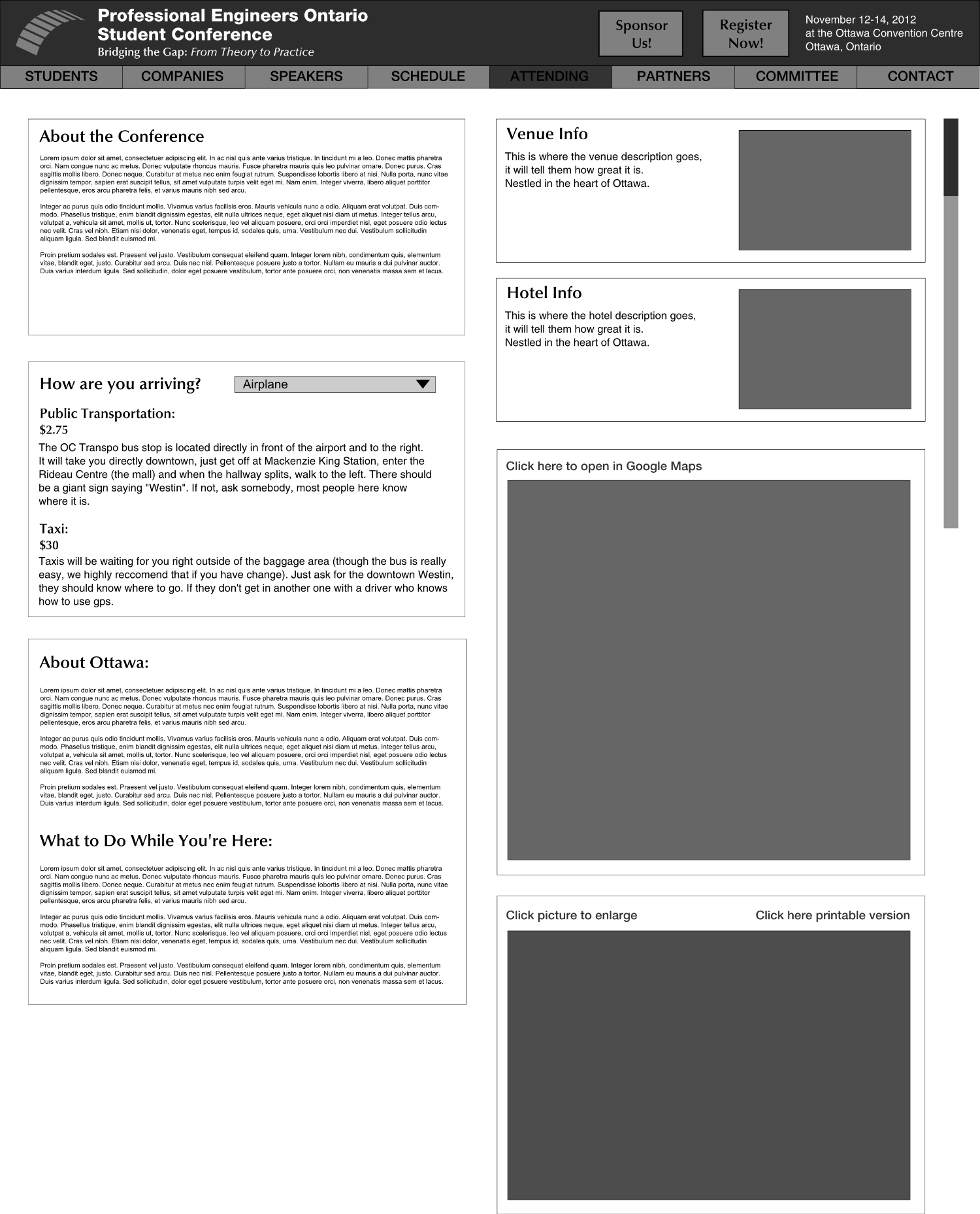
Using this hierarchy, I created wireframes for each page. The layout of each page was intended to support the visual hierarchy laid out in the page breakdown. Because the users eye is naturally drawn to images, in some cases measures were taken to ensure that the images were placed further out of sight to allow the user to see the text first if called for.

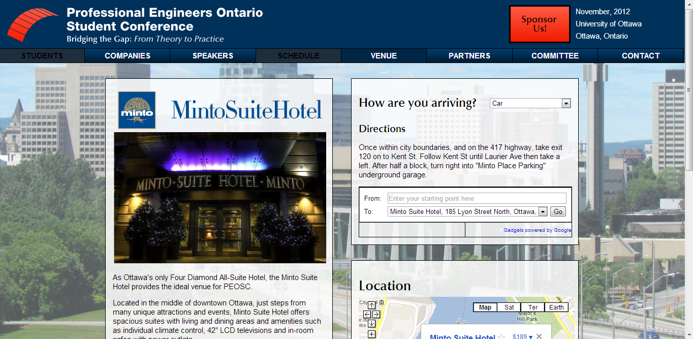
I then styled the pages and passed them off to PEOSC's Communications Director for programming, providing design guidance as adjustments needed to be made. I also learned to code in HTML/CSS through this process.
The site can be seen at www.peosc.org
